Inactive Miniion

Cervator

Org Co-Founder & Project Lead
Contributor
Design
Logistics
SpecOps
In theory there could be a lot of things pathfinding, so true, it could add up. Try it out and see, and maybe focus on making the system flexible so if there's plenty of memory available (or to cheat: if the user enables it) then use fancy fast pathing, if not then fall back gracefully to some weaker system.

And probably on the leaves - tho the system would still have to pay attention so moving through leaves would slow you down some. That's probably a little ways out atm.
 

overdhose

Active Member
Contributor
Design
World
GUI
the way I see it is that minions are dumb and don't per se use the best route available, so it actually amuses me when I see a minion go back and forth between 2 points and try to traverse leaves, making it go slower. Might just be I'm lazy though, I ain't exactly sure which of the 2 it is :D 
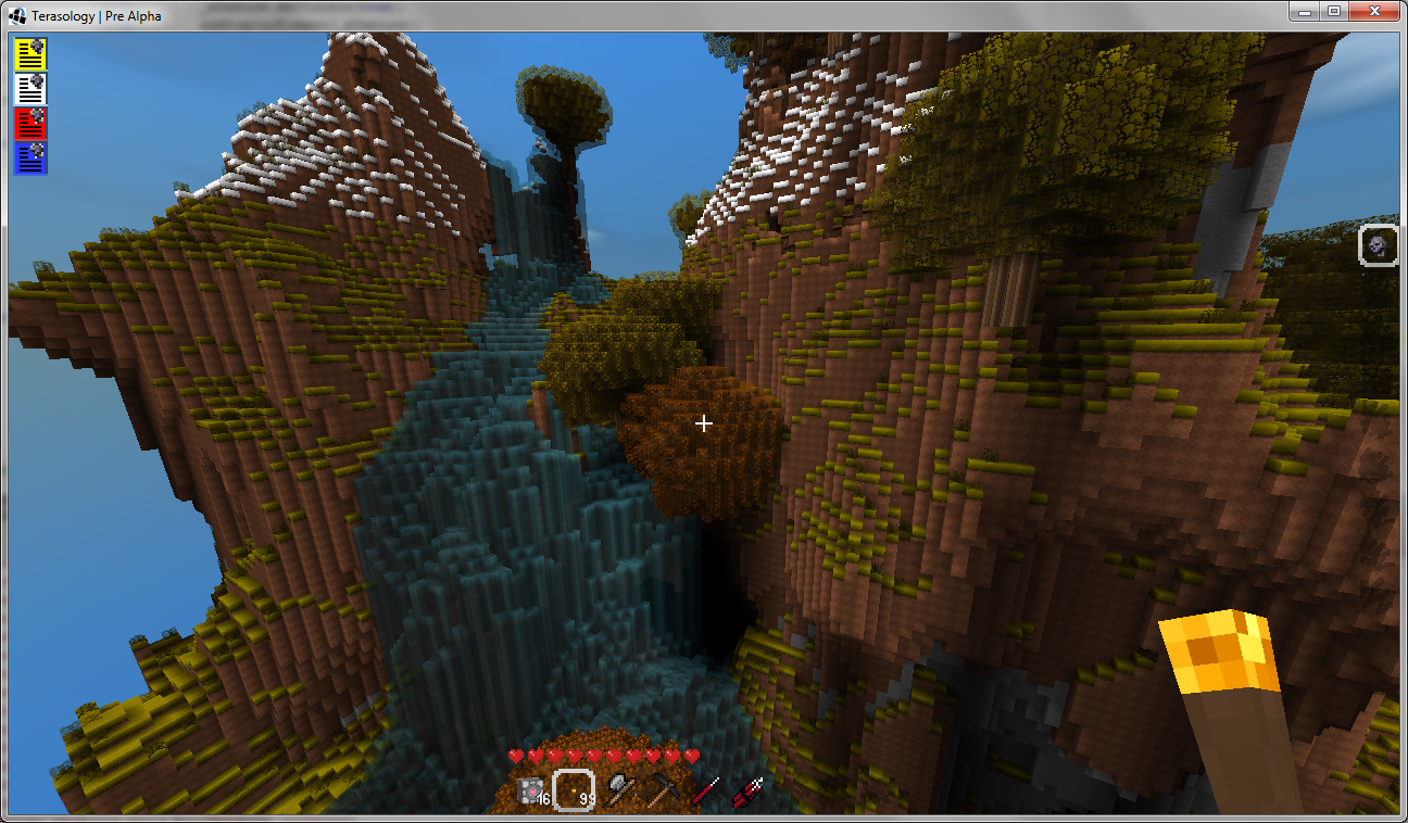
But at least, the fact that I can fly up a tall mountain and click a block and see the console report "path found" after 1 second without slowing the game down to much, brings some satisfaction. Only after a good slapping should it use the optimal path, and there is only so much slapping you can do in 1 minute. And as we can't slap yett... well you'll have to live with stupid minions untill that part is implemented :p
Sometimes I love how my mind thinks. Actually a nice idea, depending on slapping I could reverse cost of blocks to have a minion go slower / faster along it's path.... and run when slapped enough hehe.... Acceleratiiiiiiiiiiii.....
 

metouto

Active Member
Contributor
Art
Overdhose ask for two blocks .... one with red flag (stop) and one with a green flag (go) :D I tried to make them look a little wavy .... Overdhose, if you would like something different please let me know:)

waypointblockstop.png

waypointblockgo.png
 

woodspeople

Member
Contributor
Design
overdhose said:
maybe I should focus on refining the current system after all
In my experience it is better to get something working well and clearly so people can play with it than it is to make it do more cool things. This is a painful fact but it is true, if you don't want to hear "it didn't work" ten thousand times.

(Said with respect and appreciation)
 

overdhose

Active Member
Contributor
Design
World
GUI
I'll reply with a bit of literature on the subject:

Principle of good enough
concept of the good enough mother

and what I was actually looking for :
good enough economics

maybe a lil personal clarification : I could spend a lot of time in 1 feature and polish it to perfection, and you might hate it. Or I could offer you 3 equally buggy modes of play, and ask you which one you preferred and should be polished... I wouldn't believe in the principle if it wasn't for the fact I used it to create the only app still being used as a cornerstone for quality management... and working together with quality management on it's own and what data is important to them taught me quite a bit. But in the end, it's another debate, and debate originates from the fact that people believe in different things hard enough to actually debate them. The most foolish presumption you can make is that a debate might actually change the other person's belief. That is not to claim that a short debate isn't usefull : it informs your environment what you believe in, debating also acknowledges you accept that other person belief as worthy of debate. If you start looking at a debate from that point of view, and have them at least agree about that, compromising becomes a lot easier.
 

woodspeople

Member
Contributor
Design
Oh, I'm all for good enough: the perfect is the nasty evil enemy of the good. What I meant was, if you say "press X to go into minion mode" and a person presses X and nothing seems to happen so they think they have downloaded the wrong version, you haven't offered them anything to play with at all. It's like, you have to get to a certain level of playability before you can even get any feedback on cool things. Easy to say when you are not the one doing it, I know.
 

overdhose

Active Member
Contributor
Design
World
GUI
Not at all... that's why it is in the dev wiki you talked about, if I'm stuck in my code I can at least make myself usefull another way... I could hide the inactive toolbar, I could swap toolbars, I could add a little gui screen that tells you what mode you are in, and I could combine all 3... I would vote for a little gui text, but telling you you are into minion mode won't change the fact you still need to figure out how to summon a minion, which requires a bit of effort. Making a little tutorial out of it with messages is why i decided to create a message queue...
 

overdhose

Active Member
Contributor
Design
World
GUI
Well thanks to immortus solving my issue I finally made some progress on the whole message queue system, in the screeny you can see a beautiful waterfall and some message icons in the top left corner. I had to hard code some things for now to show this off, but minions are actually able to send this to the gui through an event.

I moved the icons to the left side of the screen as the minion bar on the right doesn't leave much room. To activate them I was actually thinking of reserving one slot of the toolbar containing the top message, or adding a tenth slot that looks slightly different then the standard ones. Selecting that slot and clicking it would open the top message, and scrolling up down would let you browse through messages, and / or a keybinding to open the top message. Not sure what would be best, if anyone has a bright idea how to interact better with the gui, your ideas are welcome.
 

Cervator

Org Co-Founder & Project Lead
Contributor
Design
Logistics
SpecOps
Nice!

Well, for starters, IIRC the buff bar from bi0hax's potion stuff also goes in the top left. I wonder if we need a queue for the queues? Heh, or some other way to allow multiple bars like that, maybe auto-sorted with the most active icons at the top. Or maybe put it in the top middle? Whole top is sort of tricky with the debug text and such going there. What about making the queue just grow to the left out of the minion bar, then you could even sort it by minion? Hot keys could cycle through the messages for each minion (F1 for first minion, etc). Normal bar or growing left bar, function keys are nice. I'd like the 10th hot bar slot added, but dunno if it should be special? No harm in doing so for now either way if it is easy for testing.
 

metouto

Active Member
Contributor
Art
Hope this is the right place ;)

I just got to play a few minutes with the miniions. They are a lot of fun maybe as much fun as the railgun:cool:
 

overdhose

Active Member
Contributor
Design
World
GUI
glad you liked it Metouto. I hope it will become even more fun.

@Cervator : I can easily lower the bar to half a screen down (the UI is actually sized that way :p) I just showed it like this because I wanted to point out the fact we might effectively need a discussion about the gui itself :
how much can we clutter it, how do we give it a unified feel throughout mods etc
While I don't hate the idea of letting it grow out of the minion bar, I believe it will clutter the gui in later stages. Unless you limit it to 1 message, the top one, to indicate that there are messages, that might possibly work I think, although I also open the behaviour menu at that spot atm. It raises another question though : what do we do when that minion is unsummoned / dies and another minion fills it slot...
do we delete the queue? does the slot remain locked untill you remove the messages? Won't it break immersion a bit?
That is the main reason why I created a "message queue", if we go with a per minion queue, I will need a 10th queue linked to air for what I referred to as system messages... So while it has potential I ain't sure either way.
 

Cervator

Org Co-Founder & Project Lead
Contributor
Design
Logistics
SpecOps
Yeah good point, I suppose we are beginning to have enough UI elements to consider that.

A queue as a general concept would probably make sense, for minions or other events (scrap the per minion bit) - so with a generic queue it could probably reserve a good spot somewhere. Buffs and other effects could be grouped together and go somewhere else. Other than that we have toolbars and UI windows - I wonder what else we'll run into?
 

woodspeople

Member
Contributor
Design
An idea for GUI space conflicts: use a system in the modding API similar to the system for block ID allocation. Have a "screen real estate manager" (SCREM) that apportions screen areas to mods on a first-come first-served basis. The mod walks up and says "I'd like a piece of screen 400x100 please, as close to the left side as possible, and I'd prefer vertical but I'll take horizontal if that's all you have" and the SCREM says "put your GUI here please". The SCREM would be like a "packer" in windowing toolkits like Tk. Things might move around a bit based on the mods a person has loaded, but they would never write on top of each other. The core system itself would also be a supplicant to the SCREM, but it would have a top-level priority.
 

Immortius

Lead Software Architect
Contributor
Architecture
GUI
I think that, combined with some general conventions and generic UI elements with known extension points. If we start with a basic:
* Event log on the left
* Quick bar on the bottom
* Status bar above the Quick bar

Then mods should be able to send whatever events into the event log (the engine would send network chat, minions mod would send minion events, etc), allow whatever usables in the quick bar (items in core, maybe abilities from an RPG mod, minions from a minion mod), and interact with the status bar likewise.

Ultimately it may be nice to allow users to rearrange things, but that can probably be ignored for now.
 

overdhose

Active Member
Contributor
Design
World
GUI
So basically : drop the whole "Minion mode/ toolbar" idea in the long run and just use the existing toolbar for minions as well as whatever else and combine that with the message queue as event log? All I'd have to do is actually create a message component which anyone could use to send messages to the same queue then. I was actually considering of altering my current message class to an UIgraphicsElement extended class, so that I could keep track of which message is linked to which icon on the screen (as they swap places depending on priority atm). Should I start a new thread about the whole message queueing system so we can iron out some details about it? For example : what is your vision of the "event log" you mention Immortius? more like a chat / command window, or a queue with icons? A tabbed mmo like chat component could indeed be a solution to conserve some space, and even lend itself as a place to handle the message quing

Could make a quick example based on a swing.jframe, although I have to figure out if i can make it a child of the display...
 

Cervator

Org Co-Founder & Project Lead
Contributor
Design
Logistics
SpecOps
How about the idea to let the quick bar expand upwards into an inventory? To replace the goofy character equipment / inventory screen that doesn't really work anyway.

Minions in the quick bar would sort of throw that off tho. It might be worth its own thing, especially considering the creature focus?
 

overdhose

Active Member
Contributor
Design
World
GUI
Could look into that one to. Any ideas on how many inventory rows you'd like by default? Should it be something dynamic so you can unlock more slots by levelling later on etc, just locked in a fixed number for now?
 

Cervator

Org Co-Founder & Project Lead
Contributor
Design
Logistics
SpecOps
I'd say locked in for now, for the ease, and in case we go with a non-cell based inventory later anyway. Maybe just two additional rows pop when you press 'i' (with the 10th slot added, for 30 total slots) so it doesn't take up too much space but leaves plenty of tinker space if we can also make those slots interactable.

(And also, fair disclaimer, not my idea! I just remember it from somewhere around here)
 

metouto

Active Member
Contributor
Art
Pardon my non-coding ability:rolleyes: .... but would it be to much to code to show just ten boxes only at a time ..... and then if you wanted to see what is in the next 2 sections of 10 (???) you would have to use the mouse wheel or the down/up arrow depending on which way you want to go looking ;). That way you only use the space which the 10 (???) inv boxes would take up at any one time.
 

overdhose

Active Member
Contributor
Design
World
GUI
It's a good Idea, but you still want to show I think 2 or 3 lines to start with, it would be nice to let you level your character to actually give you a goal to gain levels. And at that point, you could have a bigger inventory then the initial 27 (3 rows X9) I'll offer you by default. Unless I limit it to 2 rows, but I fear people might spend to much time reorganizing their inventory, and as far understood, we don't want that. So while I might make the UI a little compacter then it is now, I'd still vote for 27 slots + 9 from the toolbar = 36 slots to start with.
 
Top