A Brand New Logo

Cervator

Org Co-Founder & Project Lead
Contributor
Design
Logistics
SpecOps
Hey @Trekmarvel that's pretty good! :)

Could you supply it in a .svg or a set of different sizes? For Android in particular we need a whole bunch of variants for logos and such (different resolutions).
 

NeonInsect

New Member
Contributor
Art
Hi there, great work!

It would be amazing, if we could use this one prior soundtrack release.
Then I would have a solid cover artwork for the release on itunes, bandcamp etc, if I may use it of course :)
 

Cervator

Org Co-Founder & Project Lead
Contributor
Design
Logistics
SpecOps
I poked Milosh via email and he likes it too :)

@Trekmarvel I figure we have your permission to use it officially both for the game all over and even for soundtrack stuff on various other sites?

Edit: Also, we may need a perfectly square version for some places, able to squish it a little bit and still have it look nice?
 

NeonInsect

New Member
Contributor
Art
May I use the one with the spacey background? That fits perfectly since it has already 1500x1500.
 

Cervator

Org Co-Founder & Project Lead
Contributor
Design
Logistics
SpecOps
Cool :)

I think the Android icons are the ones expected to be square. I vaguely remember having to provide a bunch of different sizes, but am not actually sure how far I got with that. Been a while and I need to get back up to speed on Android dev.

Also: Art badge coming your way, seems good timing for that :D
 

Cervator

Org Co-Founder & Project Lead
Contributor
Design
Logistics
SpecOps
That's a beautiful icon @Trekmarvel !

I wonder how it would low in as low as 48x48, that's the smallest icon I can see at
https://github.com/MovingBlocks/DestSolAndroid/tree/master/res

Should the text perhaps be enlarged just slightly, maybe 10-20% both horizontally and vertically? Could you check out how it would manage at 48x48 and the other resolutions at that link?
 

Cervator

Org Co-Founder & Project Lead
Contributor
Design
Logistics
SpecOps
Okay I've been working on this some. Easy enough to add in the new icons. New game menu background is trickier :)

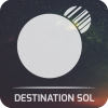
Old title logo was just the DS logo with a black background centered in the top middle with the rest of the screen also black. With the nice image with the nebula that doesn't work so well. We sort of need to have the background nebula stuff cover the whole game menu screen, then the text only covering the location where the old logo went. I tried just using a white version of the plain logo, but ... not so much:

Destination Sol_2016-06-04_17-54-21.png


That's after I spent a little time adjusting the big S - the slightly curvey stuff doesn't work so great when resized poorly (my lack of skill). You can see the original look on the E and S in the top. I think the bigger straighter S looks better, but my image manipulation skills leaves it all suffering pretty badly from jaggies :(

Probably we need to use the nebula background alone for menu background plus then add the semi-transparent version of the text as an overlay so we can position it just right. Can you try making a split out version like that, @Trekmarvel ? Ideally with the text overlay around 254x254 (well, a bigger version to begin with, but the spot currently in-game is taking a 254x254 spot from an icon/image atlas)

Existing nebula image is great for places where literally is the whole image, like so on @NeonInsect's bandcamp page for the soundtrack

On that note the Android icons are nice, but with the game being black/dark/nebula-ish should the icon also use the nebula background instead of blue? There isn't really anything blue in the rest of the app?
 

Trekmarvel

Member
Contributor
Art
@Cervator I'm sorry for the delay, there are two png files with added transparency. One of these has the superior text in bold, but don't change much the slightly curvey stuff, I think is an optical effect.

There'is also the revisited icon what do you think? :)
 

Attachments

Cervator

Org Co-Founder & Project Lead
Contributor
Design
Logistics
SpecOps
Thanks for the updates, don't worry about the delay. I get hit with those too :)

Will check against the code again as soon as I find time.
 

Cervator

Org Co-Founder & Project Lead
Contributor
Design
Logistics
SpecOps
Looking at this some more now.

Took title2, shrunk its canvas down horizontally as much as I could, then scaled the remaining image down to 254px wide which is the width we've got to play with on sol13.png (one of the image atlas files, this one has the menu graphic in a corner). But I've got crazy jaggies from it, especially on the background planet/moon :( The transparency is good though, we could throw the nice nebula background on there later.

Destination Sol_2016-07-17_19-04-11.png


If you do it to however the original is created @Trekmarvel would it look better? As close to 254px wide as possible would be ideal, or even apply it directly to sol13.png and check it in-game (lives in main/res/imgs)

Maybe same story with the icon. Would it look better produced at the exact sizes from the source rather then resizing the big icon file? Sizes present:
  • 144x144
  • 96x96
  • 72x72 (also present as "sol.ico" in the desktop module - file icon on PC?
  • 48x48
  • 32x32 (also used for "icon.png" at the root of the "res" dir - another file icon for somewhere?)
There's also a 256x256 version title.png present at main/imgSrcs/ui which might just be the original that was used as a source for the version pasted into sol13.png or so, maybe related to the image editor used by the game to pack stuff into game assets.

I think that covers all the icon/title images.
 
Top