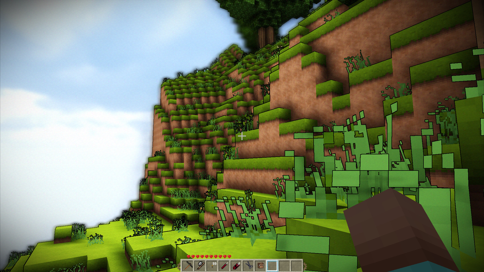
Not so bad I think... but is it supposed to be like this?
Cartoony Look
- Thread starter Skaldarnar
- Start date
I hadn't noticed the black outline before, that does stand out a bit as a stylistic thing. I guess it is one of the recent graphic tweaks begla has been playing with and "cell shading" comes to mind - that has been mentioned a time or two somewhere as well ")
Pretty sure the area is still getting tweaked a little back and forward, like the "aura" around stuff with SSAO enabled. Begla can probably provide more detail
I'm infuriatingly indifferent on the exact yes/no on whether I prefer it or not, I know that helps a lot to mention ...
Pretty sure the area is still getting tweaked a little back and forward, like the "aura" around stuff with SSAO enabled. Begla can probably provide more detail
I'm infuriatingly indifferent on the exact yes/no on whether I prefer it or not, I know that helps a lot to mention ...
I think you will always have people who like it and people who don't... I'd say let's make it configurable, but don't condemn it entirely because it doesn't suite your personal taste. I'd have to look at the code to be sure it can be optional, but I'd happily add some extra settings to the "insane" graphics mode so individual parts can be enabled / disabled.
I have thought it over all day long and come to the thinking that I do not like it because it takes away from the "natural" look of it. You don't see that black line in nature. But do I dislike it to the point I will pull up stacks and leave if it is not changed ??? No, like said above .... " don't condemn it entirely because it doesn't suite your personal taste .... " (my 1\2 cent worth)
I have to agree to most of you guys^^
Definately gives me a deja vue of Borderlands 2.
I kinda like the style on this picture.
Anyway I don't think it will fit the direction we're heading, as metouto stated, it takes much away of the natural look&feel.
And mixing the styles for natural peoples and steampunk ones will result in a mess
Definately gives me a deja vue of Borderlands 2.
I kinda like the style on this picture.
Anyway I don't think it will fit the direction we're heading, as metouto stated, it takes much away of the natural look&feel.
And mixing the styles for natural peoples and steampunk ones will result in a mess
Yeah just the view distance would need to be fixed so you don't get a black thing when you look somewhere, Also like Borderlands 2 this gives more of a steampunk feel like Nym said.I like the clean, sharp look of it. It may not fit everyone's gametypes admittedly.
Oh so much feedback on this one!
I've just played around with some new approaches to give the game a more stylized and unique look. So I ended up adding a shader applying a simple Sobel edge detector to the depth image (and applying the result in a post-processing pass). This is entirely optional and can be disabled via a simple config setting.
This is currently the default for all graphics settings though.
Looks awesome.
Looks better now or doesn't it?
Start tossing these videos into some playlists on the central Terasology Youtube channel please, Mr. HunterLooks awesome.
Lots of other good ones out there too, like this one which is also using the "new" graphics
Alright, I'll do that tomorrow, I'm going to bed for nowStart tossing these videos into some playlists on the central Terasology Youtube channel please, Mr. Hunter
Lots of other good ones out there too, like this one which is also using the "new" graphics
Nice tweaks, looks amazing now
Just one thing: Can you please reduce the amount of bloom/HDR of the sky a bit, at least at daytime I would like to enjoy a blue sky
Just one thing: Can you please reduce the amount of bloom/HDR of the sky a bit, at least at daytime I would like to enjoy a blue sky

Hope it's a bit better now. Reduced the target luminance for the HDR eye adaption algorithm to 0.5 instead of 1.0.Nice tweaks, looks amazing now
Just one thing: Can you please reduce the amount of bloom/HDR of the sky a bit, at least at daytime I would like to enjoy a blue sky
just ran around at a surprisingly acceptable looking 15 fps (insane, moderate distance on amd apu A6) and I have to say the world of Terasology does look very captivating. Makes you want to leap forward a couple of years to grab a cpu from the future...
Strange coincidence playing "no leaf clover" while watching the sun rise reminded me of the final fantasy vid made on "elevation"
Strange coincidence playing "no leaf clover" while watching the sun rise reminded me of the final fantasy vid made on "elevation"