Google Summer of Code 2020 Final Report
This Forum post is a replica of the actual GSoC Final report here
Proposal Terasology Game HUD, Graphics improvement & Gameplay Guide
Organization Terasology
─
GSoC Display name: Stefania Mak
Full Name: Makrygiannaki Stefania
Location: Thessaloniki, Greece
EMAIL: stefania.mak.project@hotmail.com | stefaniamakk@gmail.com
Table of Contents
- Table of Contents
- Introduction
- Main Report
- Educational
- Productive
- Documentation
- Master of Oreon
- LAS element rework
- Quickslot
- Ammunition slot
- Health bar
- Score
- Dialogue box
- Game over screen
- Fun!
- References
Introduction
My Project had to do mainly with redesigning screens, and more specifically HUD elements. We ended up working and renewing a total of 6 screen/elements, which I am going to get into more detail further within the report.
If I had to describe this summer in three words, these would be: educational, productive, and fun! Based on these three words, I am going to structure later the rest of the report and thus my time in the program.
You can track all progress and updates from the Forum thread:
UI/UX project Weekly Updates.
Main Report
Educational
Terasology introduced me to a lot of new experiences, and with them, a bunch of new information as well. The whole summer was a constant learning experience in coding, designing, GitHub, and teamwork.
Coding. I’ll start by the fact that I have never worked on such a large project! It has a coding structure that was way more complicated and outstanding than any other project I have worked on. This introduced me firstly to ways of how multiple people can work on a single whole project, and secondly to different things I can create and use like events, prefabs, UI files, reacting to events, and many more little things. The main coding section I focused on revolved around UI elements, which even if I have worked with on my projects before, was still quite new to me. My mentors were also always there to help me out with explaining or introducing that new method to me, so I can use it.
Design. I already had few mockups done for my proposal, but through the summer I got the chance to make more designs, study, give and receive feedback on different design ideas, mainly on my project, and secondary on fellow students.
GitHub. I learned how to write properly structured PR, Issues, and how to effectively work with Forks which’s the main purpose is to contribute to the main repository.
Teamwork. The communication between me and my mentors, but also the rest of the Terasology members, was great! I felt comfortable asking many questions, give and receive feedback, and make progress updates, while simultaneously learned how to do all of the above more effectively.
Productive
This is the main part of the review, during this time period we managed to upgrade a great deal of a module’s HUD interface! Totally, we had:
In this section of the review, I am going to write down all the work that was done from the beginning of the summer until the end. Like mentioned at the start of the Report, you can track all progress and updates from the Forum thread:
UI/UX project Weekly Updates.
─
Documentation
During the bonding GSoC period, me and my mentors created a Google Doc file to collect information regarding Terasology’s main UI and Heads-Up Display (HUD) elements. On that file, we added screenshots of these features from Terasology and other games, alongside some notes of what we like and don’t like on these references.
One of the first things done in the first month had to do with the development of that file, by adding references from other game modes of Terasology, like Metal Renegades, Light and Shadow, and more.
(2) (3)
─
Master of Oreon
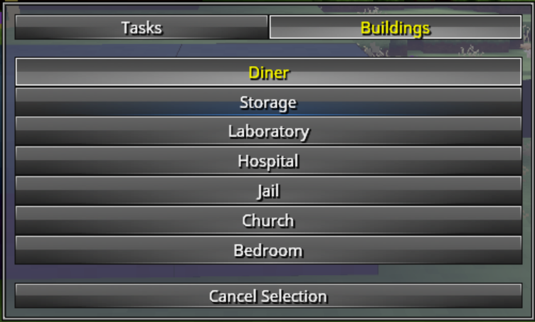
Master of Oreon (MOO) was my first interaction with how the UI works for Terasology. To get more familiar with editing the elements, I was given the task to edit the Task Selection Screen of MOO, based on an edit that Skaldarnar made on another screen of that module.
(3) (4)
The modifications I made included the addition of a title, a close x and a confirm button, and a section which will host previews of the list items within the screen.
(5) (6) While I did make all the assets, I did not incorporate them into the design but rather created two issues on GitHub with what was next for them.
(11)
Below I present some samples of the assets that were made and the current state of the Task Selection Screen of MOO:
─
LAS element rework
Within the end of the first month, and the whole second month, the focus shifted from MOO to Light And Shadow (LAS). The goal was to make a full update on its HUD elements, to distinguish them from the original Terasology interfaces, and give it its own unique new look. The upgrade done till now, covered the quickslot, ammunition slot, health bar, score, and dialogue box.
First things first, I had to look into how to edit each element. That lead me into reading more about the Delta and Override files
(7), which’s wiki page I updated with the research I did
(8), and then I applied overrides for LAS element UI modifications.
Changes per element
Quickslot
Quickslot was probably the element that got the most attention out of all. To achieve the above result, we had to both heavily modify the structure and appearance, but also add more features to some layouts that we needed to have. In bullet points, the changes and additions made by referencing the mock-up
(6) were
(12):
| Before | After |
|---|
 |  |
Ammunition slot
What I had to do first, was to find which module provided this feature, which ended up being the CombatSystem module. Mainly what we did was to change its positioning and background image
(19). In more detail, what was done is
(12):
| Before | After |
|---|
 |  |
Health bar
The health bar got the least modification so far, which was about its size and position
(7) (8). Basically:
- Size increased, for all three different styles of it - circle, spades, and hearts
- Considering the empty space created below it, after quickslot moved, the health bar was placed right at the bottom of the screen
| Before | After |
|---|
 |  |
Score
The score had a total rebrand in my opinion! It now matches better the theme of the module, and also provides the user with tiny pieces of information about the game through its design. The changes made were
(10):
| Before | After |
|---|
 |  |
Dialogue box
Following on the list, we have the also noticeable update to the Dialogue box. The whole element got a new feeling with its new design, and matched nicely with the Alice in Wonderland theme that goes around LAS; as commented by Skaldarnar: it looks a bit like a poker card. Afterward, we changed the Answer buttons, by positioning an arrow asset to each answer's left
(18), and changed the answer button's background image
(19). The changes made were
(13):
| Before | After |
|---|
 |  |
Game over screen
This screen was one of the last things that were worked on during the summer, and also one of the most significant changes in comparison with the previous version
(16) (16) (17) (18) (19). The changes that were made were
link:
| New Victory Screen | New Defeat Screen |
|---|
 |  |
Fun!
Other than the fact that I enjoy software development problem solving, the highlight of this section would be the Play Test Weekend
(15). Other than showing and seeing mine and other student's work, it was really fun playing Terasology with other members of the organization. You can watch the video from the Light and Shadow live at
Terasology Play Test - Light and Shadow - GSoC Highlight.
References
(1) Project Details
https://forum.terasology.org/threads/ui-ux-project-weekly-updates.2321/
(2) 18/May/2020 Meeting Minutes
https://forum.terasology.org/threads/ui-ux-project-weekly-updates.2321/#post-16644
(3) 25/May/2020 Meeting Minutes
https://forum.terasology.org/threads/ui-ux-project-weekly-updates.2321/post-16646
(4) 11/June/2020 Student Weekly Report
https://forum.terasology.org/threads/ui-ux-project-weekly-updates.2321/#post-16723
(5) 15/June/2020 Student Weekly Report
https://forum.terasology.org/threads/ui-ux-project-weekly-updates.2321/#post-16731
(6) 22/June/2020 Student Weekly Report
https://forum.terasology.org/threads/ui-ux-project-weekly-updates.2321/#post-16752
(7) 29/June/2020 Student Weekly Report
https://forum.terasology.org/threads/ui-ux-project-weekly-updates.2321/post-16765
(8) Deltas and Overrides
https://github.com/Terasology/TutorialAssetSystem/wiki/Deltas-and-Overrides
(9) 06/Jule/2020 Student Weekly Report
https://forum.terasology.org/threads/ui-ux-project-weekly-updates.2321/post-16783
(10) GitHub Issue: Score HUD Element Overhaul #131
https://github.com/Terasology/LightAndShadow/issues/131
(11) 13/July/2020 Student Weekly Report
https://forum.terasology.org/threads/ui-ux-project-weekly-updates.2321/post-16807
(12) GitHub Issue: Inventory Overhaul #134
https://github.com/Terasology/LightAndShadow/issues/134
(13) GitHub Issue: Dialogue Screen Overhaul #132
https://github.com/Terasology/LightAndShadow/issues/132
(14) GitHub Issue: Game OverScreen Overhaul #130
https://github.com/Terasology/LightAndShadow/issues/130
(15) 03/August/2020 Student Weekly Report - Playtest Week!
https://forum.terasology.org/threads/ui-ux-project-weekly-updates.2321/post-16850
(16) 10/August/2020 Student Weekly Report
https://forum.terasology.org/threads/ui-ux-project-weekly-updates.2321/post-16859
(17) 15/August/2020 Student half-Week Report
https://forum.terasology.org/threads/ui-ux-project-weekly-updates.2321/post-16873
(18) 22/August/2020 Student Weekly Report
https://forum.terasology.org/threads/ui-ux-project-weekly-updates.2321/post-16876
(19) 29/August/2020 Student Weekly Report
https://forum.terasology.org/threads/ui-ux-project-weekly-updates.2321/post-16896