Request Intro 3D Fonts

Josh

Member
Contributor
Hunter
Number One: Italic Block

Number Two: Qbicle

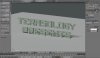
Number Three:Transuranium

Number Four: Demon Cubic Block

Number Five: Block


You decide which one looks better, or input your own suggestion from this website: http://www.dafont.com/

Vote on the poll above, if another suggestion gets made I'll add it to this list. Cervator would like the font to go with the Terasology theme of blocky so, keep that in mind while picking a font. I made a video of how it will look with a regular text I use with Cinema4D The video will just show how the intro may look. The final Intro will have much more added and more time spent on it.
Notice: This font and Intro will be used on all Youtube videos for the most part that is on one of the Terasology channels.

Video:
 

Cervator

Org Co-Founder & Project Lead
Contributor
Design
Logistics
SpecOps
I like the last one the best, plain "Block", but Transuranium is also nice (the 'G' just goes weird). The original Qbicle font is nice, but the 3Dficiation sort of does weird things to it.
 

Josh

Member
Contributor
Hunter
I like the last one the best, plain "Block", but Transuranium is also nice (the 'G' just goes weird). The original Qbicle font is nice, but the 3Dficiation sort of does weird things to it.
Yeah, the last one looks fine but I don't like how it's so open, that's why I like the first one the best, because it goes with the Terasology theme of blocky stuff and looks good at the same time, also has a retro feel to it.
 

A'nW

Member
Contributor
Art
Hmmm... personally, and I know I have mentioned this already, I think it should go with the logo's font (the logo that is up in the top banner of the forum here).
It might have to be hand modelled sure... but that is hardly difficult. For instance, here are the two words hand modelled in Blender in just a few minutes:
LogoStyle.jpg

I could even give you this model if you want (in .obj or something...).
 

Josh

Member
Contributor
Hunter
Hmmm... personally, and I know I have mentioned this already, I think it should go with the logo's font (the logo that is up in the top banner of the forum here).
It might have to be hand modelled sure... but that is hardly difficult. For instance, here are the two words hand modelled in Blender in just a few minutes:
View attachment 574

I could even give you this model if you want (in .obj or something...).
You could do it from scratch, but then you're making many objects and that's adding a lot more things to sort out in Cinema, I'll give it a try and post back here if I get it. Could you maybe give me the size of all of the cubes/rectangles you used in blender and I'll move it over to Cinema?

Edit:
Measurements like this:
 

Cervator

Org Co-Founder & Project Lead
Contributor
Design
Logistics
SpecOps
Qbicle might work better if it got modeled naturally in 3D rather than with a short-cut gadget, but that's a lot more work :)

Our logo "font" could work too for matching, or we could update the logo sometime. In-game font differs as well. Eventually we might want all of them to match, something novel there would be neat.
 

Josh

Member
Contributor
Hunter
Qbicle might work better if it got modeled naturally in 3D rather than with a short-cut gadget, but that's a lot more work :)

Our logo "font" could work too for matching, or we could update the logo sometime. In-game font differs as well. Eventually we might want all of them to match, something novel there would be neat.
"Short cut gadget"?
 

Cervator

Org Co-Founder & Project Lead
Contributor
Design
Logistics
SpecOps
"Short cut gadget"?
Well, whatever the magic trick is that you've figured out that adds the 3D effect to the font :)
 

Josh

Member
Contributor
Hunter
Well, whatever the magic trick is that you've figured out that adds the 3D effect to the font :)
It's a program, and it's quite a expensive program at that. Cinema4D which is pretty similar to Blender, Just better and used for intros and stuff.
 

Cervator

Org Co-Founder & Project Lead
Contributor
Design
Logistics
SpecOps
Nice :)

It looks very spiffy from a technological perspective, and it is closer than the rounded font, but there's something that still just doesn't connect it to Terasology for me. Not sure what it is - maybe the high tech / high detail vs low detail retro style? The shininess / mirrored stuff? Explosions not made of a bunch of primitive blocks? I feel bad picking on it like that, since it is really nicely done.
 

Josh

Member
Contributor
Hunter
Nice :)

It looks very spiffy from a technological perspective, and it is closer than the rounded font, but there's something that still just doesn't connect it to Terasology for me. Not sure what it is - maybe the high tech / high detail vs low detail retro style? The shininess / mirrored stuff? Explosions not made of a bunch of primitive blocks? I feel bad picking on it like that, since it is really nicely done.
Having it explode into blocks would be hard, it's set up to break each letter into 20 pieces, which the pieces are random so I'm not very sure on how I would make it explode into primitive blocks. The reflections are just to make it look better so it's not as plain, like I said that's just a little preview/test. The actual intro will be longer, better and fit Terasology better.
 

Josh

Member
Contributor
Hunter
What about not having the text be made of voxels but instead be a voxelised text?
This would fit into the normal building style of TS :D
Thanks for the link :) I'll try it out.
Edit: It's not for the version of Cinema4D I have, I have R13 that only supports R11 and R12, I'll look for a plugin. That was only a project file anyway.
 

Nym Traveel

Active Member
Contributor
Art
World
Plugin/project file, doesn't really matter in c4d. This is all done within xpresso - so no need for external plugin things (most plugins also just create a hirachy with some predefined xpresso tags)

I can't really imagine where the problem with old xpresso in r13 should be. If you're a bit familiar with xpresso you can try to recreate it. In fact it's just a mograph cloner which filles the bounding box of an object with cubes and then set the size of the cubes which aren't enough intersecting the original shape to zero. :)
 

Skaldarnar

Development Lead
Contributor
Art
World
SpecOps
From the five examples I like no. 5 best, but I agree with A'nW sticking to the fonts we "have" (in the meaning of using for the forum or ingame).

What do you guys think about an intro that's laid over the beginning of every video (only the text, no background or something, _exploding_ peaces would just vanish). By doing it so I think we have the direct connection to the game and what we are doing.

I have no example at hand, but if I find some I will post it here ;)

Edit: I thought of something like this, maybe one can blur out the video a little bit to not distract the viewer completely...
 

Cervator

Org Co-Founder & Project Lead
Contributor
Design
Logistics
SpecOps
That's a nice way of doing the intro - is it harder to splice in though? Right now my video editing sadly amounts to deleting frames out of Windows Movie Maker ... :raritycry:
 
Top