Maintenance Crash Reporter

msteiger

Active Member
Contributor
World
Architecture
Logistics
Name: Crash Reporter
Summary: A little utility for making crash reporting easier from different projects
Scope: A library for facades and TerasologyLauncher
Current Goal: Report crashes (stacktrace, log files, etc) on different social platforms
Phase: Maintenance (foundation mostly complete, being tweaked)
Curator: msteiger
Website: https://github.com/MovingBlocks/CrashReporter
Jenkins: http://jenkins.movingblocks.net/job/CrashReporter/
Dependency: group: 'org.terasology', name: 'CrashReporter', version: '1.1+'


manu3d

Active Member
Contributor
Architecture
Can already/should the crash reporter also provide information on the user's hardware and software configuration?
 

msteiger

Active Member
Contributor
World
Architecture
Logistics

manu3d

Active Member
Contributor
Architecture
Sure! I'll do the Italian version sometimes over the next 24-48 hours! Can I just post it here?
 

msteiger

Active Member
Contributor
World
Architecture
Logistics
After some discussion on GitHub, I reworked CrashReporter a lot and came up with a wizard-based design that aims to support the user more:

upload_2015-1-30_14-59-48.png
upload_2015-1-30_15-2-2.png


Uploading the log to PasteBin is now part of a series of steps in the wizard...

upload_2015-1-30_15-3-9.png
upload_2015-1-30_15-3-21.png


What do you guys think of the Wizard concept? Do you think it is more supportive than the single-page screen with tabbed panes?
 

Cervator

Org Co-Founder & Project Lead
Contributor
Design
Logistics
SpecOps
Looks good :)

I'd put the GitHub button at the bottom with IRC in the middle

Is the full log still available or is it just the stack trace visible? Is the wizard "optional" for power users, where you can still get to the normal buttons? I might favor pushing the wizard format (it is the most visible in the middle) but leave the buttons visible near the button in case they're wanted right away without going "Next" first

Maybe an extra "Copy to clipboard" button would be a nice convenience too
 

Skaldarnar

Development Lead
Contributor
Art
World
SpecOps
@msteiger Is the upload automatically reported to us? From the four screenshots it might look as if the log file is uploaded to us (like - submitted to a responsible person/team) and the user might go to close the wizard without reporting in the forums or on IRC.

@Cervator I think power users could also start without CR enabled and directly submit the log file from the file system. Additional buttons might be more confusing to the "normal" user then helpful in general.
 

Cervator

Org Co-Founder & Project Lead
Contributor
Design
Logistics
SpecOps
@Cervator I think power users could also start without CR enabled and directly submit the log file from the file system. Additional buttons might be more confusing to the "normal" user then helpful in general.
True! From source already leaves CR off. I just saw the multi-step process and thought some users might get impatient over it. But that's a nitpick :)
 

manu3d

Active Member
Contributor
Architecture
One step could be removed by having the very first screen reporting the error in one text field and having a second text field showing the log, with the option to upload it.

Also, it'd be good if once the log has been uploaded a link to it is provided, perhaps with a copy-to-clipboard button, so that if the user wants to talk about it in IRC/Forum/GitHub he can easily cut&paste the link there...

I like the idea of a wizard though. It will be very useful, especially for younger users.
 

msteiger

Active Member
Contributor
World
Architecture
Logistics
I think the wizard is mostly complete now.
upload_2015-2-1_17-56-58.png
upload_2015-2-1_17-57-8.png

Page 1 and 2

upload_2015-2-1_18-0-55.png
upload_2015-2-1_18-3-6.png

Page 3 and 4

You can move to Page 4 only if you explicitly opt out of the uploading process. This was made to keep users from just clicking through the pages without looking.
In analogy to that, the dialog won't close, until one of the three buttons was clicked (you can still close it at the top right corner)

You can try it out at CrashReporter/develop with

gradle runInteractiveTest
 

manu3d

Active Member
Contributor
Architecture
So, no chance of conflating screen 1 and 2 in one huh?

And what about replacing the text and meanings of screen 2's buttons so that they are "Upload Log/Don't Upload" instead of Previous/Next? They'd lead to screen 4 anyway, but we'd skip screen 3.
 

Cervator

Org Co-Founder & Project Lead
Contributor
Design
Logistics
SpecOps
I wonder if some users would just copy paste the stuff from step 1, leaving us back at the original problem of stacktrace only :)

With the exact error listed above the textbox, maybe we can just show the whole log file and the edit window right away, maybe scrolled to the bottom?
 

msteiger

Active Member
Contributor
World
Architecture
Logistics
OK, I'll merge screen 1 and 2 and see how it goes from there.

I'd like to have screen 3 separate to make it clear that the user is actively doing something here. We could list alternatives to pastebin, maybe even (our own) ownCloud server. There's an android library for it - I wonder how much effort it is to use it from plain Java.
 

msteiger

Active Member
Contributor
World
Architecture
Logistics
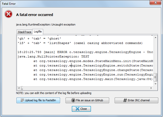
Merged! The stacktrace is not displayed anymore. Just the exception type + localized message (where available) and the complete log file.

upload_2015-2-2_18-16-56.png
 
Top