unified graphic style

Cervator

Org Co-Founder & Project Lead
Contributor
Design
Logistics
SpecOps
I'll step out on a limb and say that I'd really like to see Untrue Tao happen with the two fairly specific factions in there discussed in the world theme thread :)

Steampunk goes well with multiple options and could easily translate into a more mechanics-centered setting later/earlier/in parallel with Tao. I suspect there'd also be a way to also flavor a nature/harmony version of the same (in code) mechanics system for the other faction in a more general setting (different races/factions end up with mechanics systems that do about the same stuff, but look different).

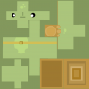
To recap my stance from earlier threads I believe the disjointed style by glasz is excellent and very distinct, and I could possibly see a whole world filled with that, but all the art would have to fall within a fairly narrow range, which might cause trouble long-term with multiple artists each having their own preferences (unless we can just make a bunch of glasz clones to rely on for all eternity). A'nW on the other hand has a more general look that would probably be easier to pick up on and replicate, but is less distinct (tho it would fit perfectly in a DF-world) - maybe utilitarian is a good word?. Finally, eleazzaar shakes it all up with the idea of flat-faced creatures with the potential to express emotions via a facial palette. I might be using that term wrong or in an amusing fashion, not sure... :cautious:

I think what we need is a general style for the world, with sub-styles like "disjointed" models for series of creatues (like elementals or other seemingly magic-related things, maybe even the harmony faction/race itself?) and any associated architecture / gear. At that point it is less of a style and more of a function of the object? And it would allow us to have one over-arching style anybody can adopt to while still having individual artists be able to bring a bit of personal flair into one or more specific areas.

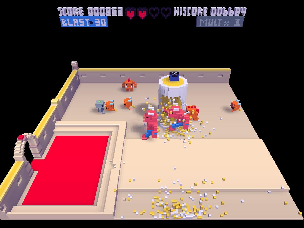
The over-arching style might be as simple then as "textured blocky creatures like A'nW's", "more flowing simplicity with flat faces like eleazzaar" or even "colored voxels a la CubeWorld" - tho, really, maybe more of a combination of the first two, with the third just included as an example of contrast to hint at the scope we're looking at. Does that make any sense? Maybe I'm entirely off my rocker, but wouldn't it also be possible to texture across a blocky face (glasz/A'nW) somewhat in different expressions, just including a bit of protrusion for effect?

Would it help to try getting everybody relevant on IRC at about the same time or is this probably just something that needs to play out here in the forum with some more art tweaks to get to a final unified style?
 

glasz

Active Member
Contributor
Art
It makes sense, the textured expressions would complement well a cubic modeling and would be kind of a distinct style. I'm putting the animated face texture on my todo list.

A little irc meeting seems a good idea to me...
 

eleazzaar

Member
Contributor
Art
I have nothing against the "disjointed" style with the floating arms/legs. I don't think it is something that lends itself to be mixed and matched with more conventionally "connected" beings. All or none-- or it will be a disconcerting, and stylistically incongruent.

I do think that the head should probably be floating as well-- that would be a bit more consistent.
 

glasz

Active Member
Contributor
Art
I'd like to propose a way to work on the art part. The situation seems to be that coders need assets quickly to work with, and artists want some time to do proposals and debate (or am i the only one?) so as to narrow a style that is nice and consistent. We could make it a priority to provide placeholder art on request (starting maybe with animals since they are needed in lots of contexts). The idea would be not to try consistency but to propose and test ideas until we have defined a style that works for everybody. Then we start the "unified" phase where we replace placeholder art with the nice and shinny one.

What do you think ?
 

Cervator

Org Co-Founder & Project Lead
Contributor
Design
Logistics
SpecOps

overdhose

Active Member
Contributor
Design
World
GUI
waah fast can't wait to try it out hehe ^^

here's the png already :turtle_DIF_template.png
 

eleazzaar

Member
Contributor
Art
cool.
 
D

Deleted member 121

Guest
Haha... I think the texture sucks. Regarding the thread topic, there should be a devoted texture artist to maintain consistency. If not, multiple texture artists who are on the same wave length, not just contributing for the sake of it.

Considering you're using a free texture pack for now (not sure if you're keeping it/plan on making your own one), you should try following that style/follow pixel styled art.

http://www.polycount.com/forum/showpost.php?p=1603949&postcount=8891


http://www.polycount.com/forum/showpost.php?p=1604931&postcount=8898


http://www.polycount.com/forum/showpost.php?p=1580716&postcount=8712


The style in the links above is faux pixel art, the textured artificially fashioned to fit the UV unwraps of the meshes.

The .psd I provided suited the concept and was just for reference for which UV cluster was which part on the mesh (head, torso etc..)

Hopefully someone can take it on and make it look pretty.

Next step, rigging and securing a clean animation style for the blocky assets.
 

glasz

Active Member
Contributor
Art
I like the iron man one. How do you make the faux pixel look? Any tutorial?
 

Cervator

Org Co-Founder & Project Lead
Contributor
Design
Logistics
SpecOps
Quick note on the existing texture pack (so low on time these days, arrr): We tried getting in contact with its author a couple times and got a little bit of back and forth going, he seemed happy we were using it and willing to help with more requests, but then I stopped hearing from him. Without him actively involved I'm afraid those textures will remain placeholders - I think we'll have to replace the remainder sometime.
 

glasz

Active Member
Contributor
Art
I thought i'd do a little recap on style in 3d game. Most of you know all that allready, but it can be usefull for further discussions.

Ordinary photorealism :

call of duty


This is the most current : the idea is to provide the player with as good an illusion of reality as technologically possible. Wich mean not good at all, but the novelty of the computer generated illusion seem to work on most players. It requires experts, very specialized, artists, lots of ressources (you allways have to use the maximum of computer ressources if you want your illusion to remain new). Plus its getting old quickly, baddly made it's ugly, and anyway the illusion is chattered by the very limited interactions you have with this very detailed world.

Stylised photorealism :

mirror's edge


Here we have photorealism with an edge (huhuhu) : a clear ghraphic chart (mostly the use of colors) has been put on top of the photorealistic foundations. Together with the gameplay it provides a trippy feel to the game.


Comics :

mad world


yo frankie


TF2


Here you decide your priority is not realism but a strong graphical identity. Often inspired by cartoons, comics and manga. It can be high on details and ressources heavy too, but doesnt have to.


Retro/experimental :

You create graphics that are neither realistic nor an identified form of graphical coolness. For example you decide that those old 8 bit games with graphics crippled by technical limitations were actually kind of cool. Or you might want to bring in the fields of 3d game graphics something that hasnt been tried yet , or you think is underused (Tron?).

voxatron


« Voxel games» like minecraft or voxatron have a « natural » affinity with the 8 bit style , since they are from a time where the number of pixels available were limited. Today it's the number of voxels that are limited. Thus using an 8 bit style for non landscape things help them feel more « natural » with the voxelated landscape.


Proteus is kind of "radical" graphically and very cool, check the site : http://www.visitproteus.com/?page_id=42
 

woodspeople

Member
Contributor
Design
Very interesting and useful glasz. I wonder about the "natural affinity" thing though. Looking at what I get for "voxel games" in Google Images I see, for one, FortressCraft, which mixes detailed 3D models with an 8-bit-looking background. It doesn't look stylistically strange at all. It doesn't sound like people find it incongruous either. After all I think people are aware that the voxelation is an artifice, not a real limitation. If you made a game where everything was drawn as triangles or hexagons or spheres, people would take that in stride too. So when games mix voxelation with other ways to draw things ... well, it's just another layer of style. Castle Story seems to be another game that mixes detailed models with blocky backgrounds. In animation movies, it's common to render the backgrounds in a different visual style than the characters. Sometimes differences of style have meaning. So I can't see any real reason that a voxelated game has to have any particular limitations to what is drawn within it. I guess the challenge is, given the fact that TS is a voxel game, what should it look like? I don't think there are any given answers to that question. It is up to the great minds gathered here to come up with something exciting. Yes?
 

glasz

Active Member
Contributor
Art
I totally agree with you, we don't have to stick with the 8 bit look. It's just the easiest, fastest road available. Creating our own style from scratch would take a little longer, but would be more fun in the end.
 

woodspeople

Member
Contributor
Design
If this was a commercial project the only real question would be, what will people buy and how can we get something out the door they will buy with the least cost up front? But TS is something entirely different. It's a sort of game itself, the game where we build a game we like. In that situation the question is not about what is correct or natural or acceptable but: why are we participating in the game of building TS? What do we want out of it? What graphical style would make that game as fun as it could be? What would give us the creative energy to make us want to keep playing the game? Because for something like this if you don't have creative energy ... you don't have a game. The game we are playing or the game we are making. (My humble opinion only.)
 

Cervator

Org Co-Founder & Project Lead
Contributor
Design
Logistics
SpecOps
Love is super distinct, doesn't seem to really be anything like it out there, very impressive. Sometimes it is a little too abstract for my tastes, tho it appears to have gotten a little less abstract than in the past. Haven't seen that level of city stuff before either.

We're in voxel land, maybe cubic meters, maybe a little less, but I do believe we'll create some stuff at a finer detail level. The natural terrain might be rather blocky and rough (full blocks), but I think trees and large plants could be more distinct (to take advantage of the organic growth simulator - not to be confused with Plant Studio) using CustomBlocks that are only partial blocks (slimmer trunks and branches). Architecture is a shoe-in for a higher detail level as players chop blocks into half blocks into quarter blocks and put them together to arrive at a less block approach. Creature models will be more detailed yet. Plants based on models rather than billboards or full voxel blocks? I could see them possibly fit in.

I think sharp corners vs gentle curves might be tricker than just some objects having a higher level of detail than others. "High" poly curvy fern models and sloping grasses might be more of a problem. The style itself could for instance just focus on being highly blocky, but at different detail levels, made shiny with some of the fancy graphic effects begla put into the game from the very beginning :)

What do we want? To build a neat engine and world, I think. What do the players want? To build neat and detailed stuff, I imagine (putting aside the whole creature management for just a moment). I do suspect the majority of voxel world wizards long for higher detail rather than lower.
 
Top