Archived Searching for a pixel artist
- Thread starter Chrisk
- Start date
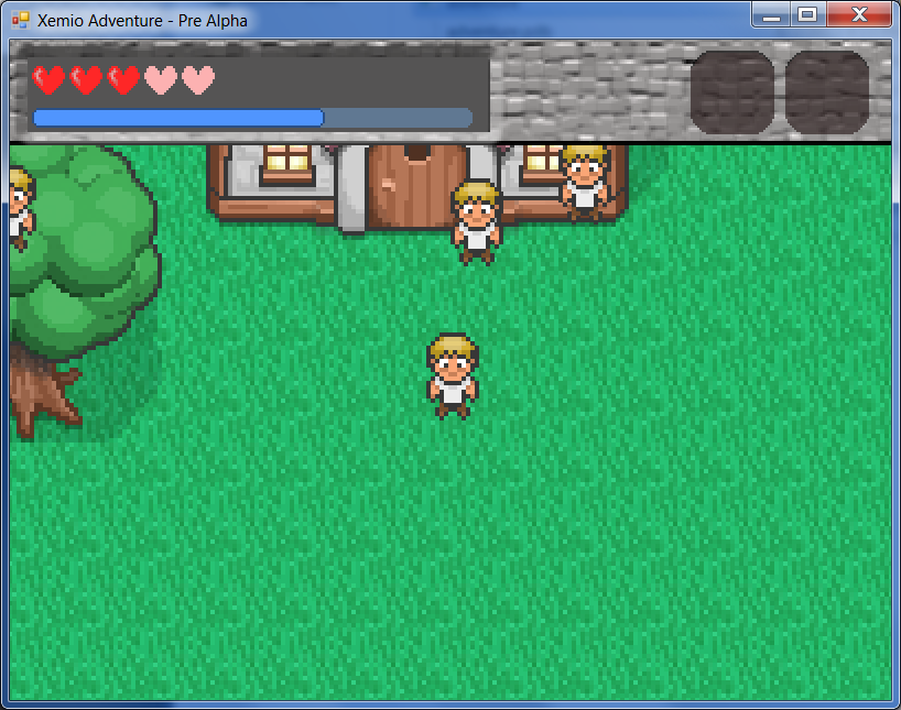
UI Changes .... How is the stone look? I changed the circles into hearts and the bar. Thoughts?

Here are the XP and heart changes


I'll mess around with the background some more. Anything you have in mind? Maybe a more "wood" kind of theme or ... hmm. Well, any ideas let me know. =)
Or .... what about no background? Just have the UI elements float over the graphics?
Or .... what about no background? Just have the UI elements float over the graphics?
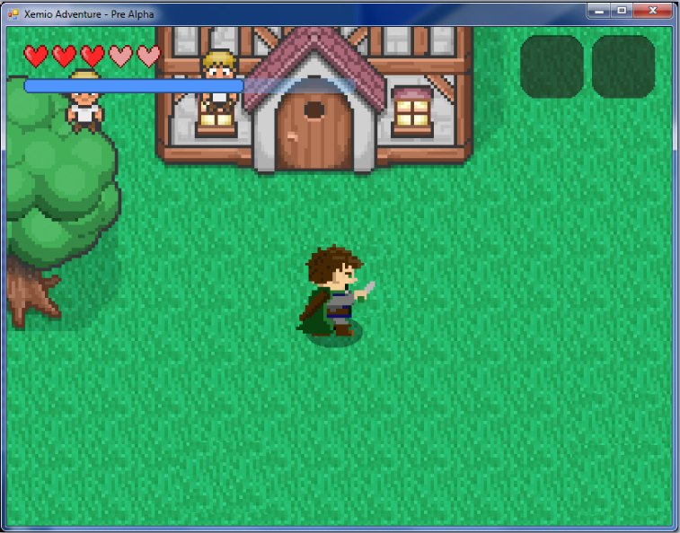
SuperSnark, what does it look like if he bends his left arm in the middle frame a bit. I looks a bit static. But else, nicely done!
Would it be possible to do a little bit more like "interpolation" frames? The animation still looks a little bit static, but I really like the hero, great job SuperSnark 
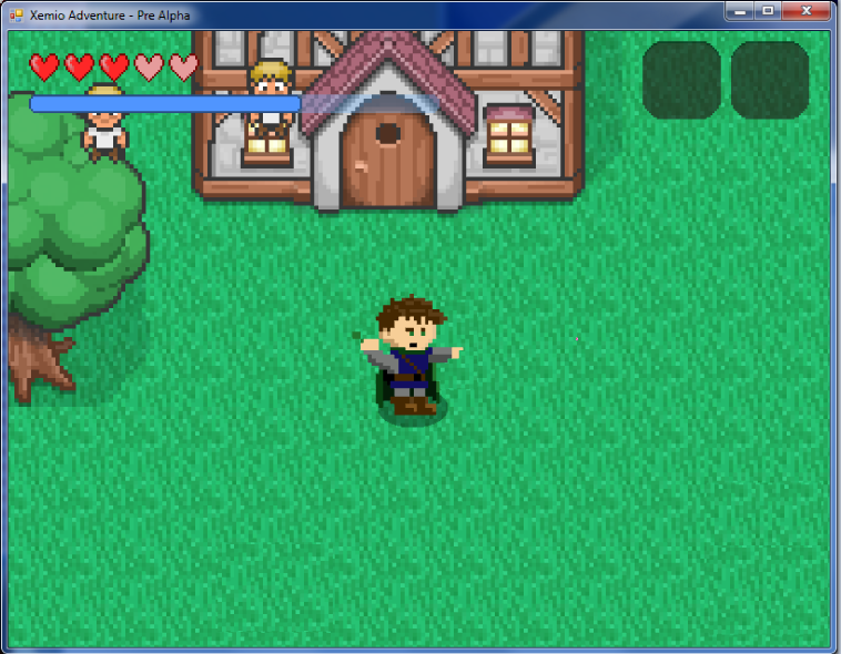
I just made some tests if the perspective would fit inside the game and it turned out good We are currently btw focusing on more engine code than the actual game, since some functionality is still missing. The engine can also run singleplayer code as a multiplayer game so we may be implementing a multiplayer co-op mode.


I just made some tests if the perspective would fit inside the game and it turned out good
Yep, I was thinking the same thing Chris. I'm definitely learning as I go. =)
I think I'm going to come up with a generic walk first, from multiple angles - front/back/left side/right side first. I think that should be pretty simple. Then I'll focus on smoothing out the combat swing.
What other animations do you need?
I think I'm going to come up with a generic walk first, from multiple angles - front/back/left side/right side first. I think that should be pretty simple. Then I'll focus on smoothing out the combat swing.
What other animations do you need?
Walking Animation
 <--sprite sheet PNG
 <-- sprite sheet GIF

I have no idea why the background goes pink ....
I have no idea why the background goes pink ....
Wow, that is really smooth and good looking, great job SuperSnark  I already answered to your last post, but it somehow wasn't submitted, so I'm trying to repeat myself here:
I think the first animations we need would be walking and running animations for each direction, a "draw sword" animation, an animation for carrying things (both arms going up and staying on top of the heros head) and animations for each weapon, like bow, staffs etc.
The next step would be creating a basic tileset so we could start creating maps already
Chrisk - any progress on your game?
SuperSnark Sorry, totally busy with working and composing music, did not have the time to continue working on the RPG 
