Screenshots!
- Thread starter Kai Kratz
- Start date
I was flying around the other day in the May 17, 2012 stable version when I found a cactus getting ready to jump into the water off his/her diving board  ......
Attachments
-
922.6 KB Views: 867
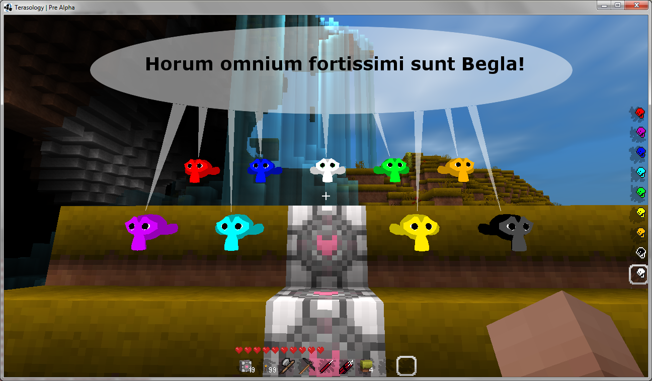
pathetic attempt number 2

this one actually made me wonder how you would achieve a similar effect ingame... instead of have each individual minion spam it's own text bubble, synchronize them to share 1... not that I have text bubbles to start with... yet.
this one actually made me wonder how you would achieve a similar effect ingame... instead of have each individual minion spam it's own text bubble, synchronize them to share 1... not that I have text bubbles to start with... yet.
Just conceptualizing out loud with those screenies or is there a difference? 
Making them share a text bubble sounds like too much work for what it is worth, IMHO. Little animated icons above their heads tho would be win.
(Also: Yay colors!)
Making them share a text bubble sounds like too much work for what it is worth, IMHO. Little animated icons above their heads tho would be win.
(Also: Yay colors!)
That's the Blender monkey head, isn't it? Suzanne? Do they mind if we use it? Should we have something more unique to TS? What about that cool dwarf glasz (sp?) made?
And: Yay colors! They look super!
And: Yay colors! They look super!
Trmx
New Member
Nice screens up here 
Explore the game today and decide to upload some screens too.
Edit ( Yes a little bit off-topic):Actually my Computer had to fight with the game anyone else got the problem too ? Yeah I know it Pre Alpha but may someone know how much system memory are recommenced ?

Uploaded with ImageShack.us

Uploaded with ImageShack.us

Uploaded with ImageShack.us

Uploaded with ImageShack.us
Explore the game today and decide to upload some screens too.
Edit ( Yes a little bit off-topic):Actually my Computer had to fight with the game anyone else got the problem too ? Yeah I know it Pre Alpha but may someone know how much system memory are recommenced ?

Uploaded with ImageShack.us

Uploaded with ImageShack.us

Uploaded with ImageShack.us

Uploaded with ImageShack.us
Welcome and nice shots! And hmm, maybe fog should be disabled in desert biomes 
With a gig like shown in your first screenie you can make the game suffer a bit with a big view distance. Should be fine on low or a notch above that. When I run (out of IntelliJ) I end up with a 2 GB max and can push total usage past a gig. With a speed potion I can then also somewhat outrun chunk generation which can leave the world looking kinda funny like shown. I suspect low CPU speed could make that more likely if it slows down chunk generation.
With a gig like shown in your first screenie you can make the game suffer a bit with a big view distance. Should be fine on low or a notch above that. When I run (out of IntelliJ) I end up with a 2 GB max and can push total usage past a gig. With a speed potion I can then also somewhat outrun chunk generation which can leave the world looking kinda funny like shown. I suspect low CPU speed could make that more likely if it slows down chunk generation.
Found two very nice threads in the German community board showing off some buildings they've made:
http://terasologyforum.de/board5-terasology-allgemein/board13-bilder-ecke/265-janred-s-bilderecke-p/
http://terasologyforum.de/board5-terasology-allgemein/board13-bilder-ecke/282-bizmann-s-bilderecke/
http://terasologyforum.de/board5-terasology-allgemein/board13-bilder-ecke/265-janred-s-bilderecke-p/
http://terasologyforum.de/board5-terasology-allgemein/board13-bilder-ecke/282-bizmann-s-bilderecke/
Trmx
New Member
Got a really pretty world generated today 

Uploaded with ImageShack.us
My Project
it's a little bit too big for a treehouse but hey it's a game
This are WIP Screens !

Uploaded with ImageShack.us

Uploaded with ImageShack.us

Uploaded with ImageShack.us

Uploaded with ImageShack.us
Sorry for this big post

Uploaded with ImageShack.us
My Project
it's a little bit too big for a treehouse but hey it's a game
This are WIP Screens !

Uploaded with ImageShack.us

Uploaded with ImageShack.us

Uploaded with ImageShack.us

Uploaded with ImageShack.us
Sorry for this big post


